Showing posts with label complementary colors. Show all posts

Friday, September 5, 2014

"Cleopatra's Prize"


Inpiration:  "The Colors of Egyptian Art"


Leafing through a catalogue recently, I came across an example of Egyptian art.  I cut this part out because I love the combination of colors and wanted to use them in a bead embroidered cuff bracelet project.


I've covered up a part of the writing in the lower left corner to make it less distracting - but the colors are black, terra cotta, turquoise/verdigris and a subtle, light gold color.

The above photo shows the beaded bracelet on the foundation before it was attached to the inner brass cuff.
It's always easier to see the whole design flat like this, instead of wrapped around the circular cuff.   


click on any image to enlarge

The turquoise that I chose for my bracelet is a much stronger color with a deeper intensity than what is shown in the example of Egyptian art above.  I was happy with the colors I chose, and the ones in the example were merely a jumping-off point.  Perhaps at a later date I'll use the same inspiration but choose a true light verdigris and incorporate the light gold, as well.

For now, I liked the stronger palette - and I always go with my first instincts.

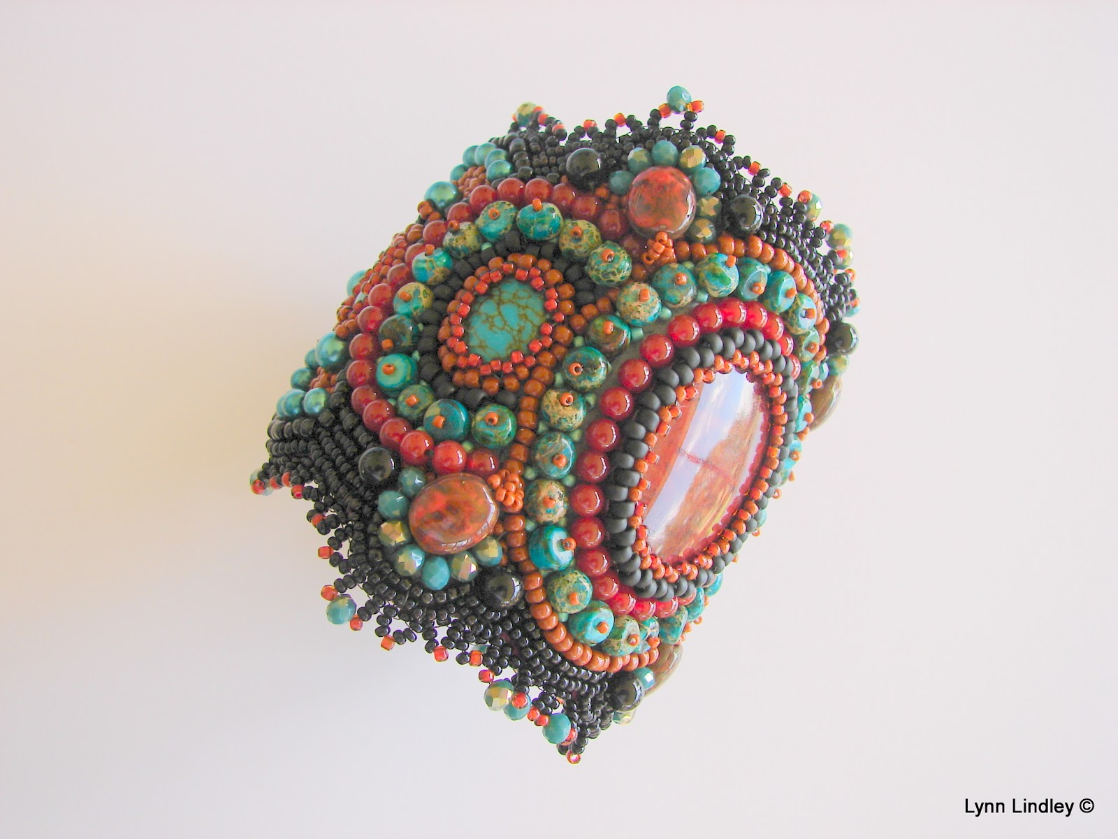
The turquoise stones in this bracelet are dyed Jasper. These small disks were arranged flat with a size 15 terra cotta glass seed bead as a "stop" bead to hold them down.  They showed more of the Jasper placed this way, instead of lined up flat, side to flat side.

 I've decided there just isn't a "look" that Jasper can't fill in for - it's been my go-to gemstone for most of my projects.  The central oval cabochon is also Jasper, and this one has a rich terra cotta color that works so well with the turquoise.

The round stones with an orange glow are Carnelian.  This stone marries well with turquoise, as it is a very close complementary color (green-turquoise + red-orange).  In addition, I added in some faceted crystals with a turquoise and gold, and a number of turquoise-colored glass pearls in two sizes.  The rest are seed beads - all glass beads, in sizes ranging from 8 to 15.  The blacks are both the shiny opaque black (Czech size 12) and the matte black (Japanese size 8) for added interest.  Tiny light turquoise seed beads are intersperced in any areas where the round stones left a bit of a gap.

The edges of the cuff are finished off with a picot edging,
and the underside is a very soft teal-colored UltraSuede. 


As usual, my work is hand-sewn and embroidered on Nicole Campanella's NBB, the foundation that is perfect for this work.  There is a brass bracelet blank inside sandwiched between the top beaded part and the underside UltraSuede, which is in a rich teal color.

For more information on my preferred bead embroidery foundation called NBB, please click here:
http://beadwright.com/

Contact me if you are interested in sources for brass bracelet blanks or UltraSuede.


Monday, April 21, 2014

"Celebration" ~ Bead Embroidered Cuff Bracelet

"Celebration"


Many times my bead embroidery projects begin with a color choice.  Other times it's a special gemstone cabochon that I want to feature, and then I pick colors to enhance that particular piece.

With "Celebration" I turned to two printed artworks that I have saved for a few years because I loved the color combinations in both paintings.  One painting is by Thomas Cooper Gotch and it is called "The Child Enthroned." This artwork features a young girl wearing an elaborate robe and sitting on a throne with a halo behind her head. (Seen below on the bottom of the photo on the diagonal.)  The other painting is of a mother holding her sleeping infant.  This was a Christmas card, and unfortunately, I do not know the name of the artist or the title of the painting itself. [If you know, please tell me, as I'd love to know the name of the artist or the title of the painting!]


What these two paintings have in common is their similar "colorway."  Both paintings utilize the complementary colors of green and red - and in these two cases, the green leans towards turquoise, and the red leans toward orange.  The addition of a golden yellow and a creamy oyster color add to the harmony.


click on any photo to enlarge

Turquoise-green and red-orange (coral) are my two most favorite colors, so it's no surprise when I choose them for my bead embroidery.  As complementary colors, they sing in the presence of each other.  

The above photo shows the bead embroidered cuff bracelet flat on the beading foundation before it is attached to the brass cuff bracelet.  
Above photo and below photo show the finished cuff bracelet.
The central focal piece is a Jasper gemstone.  It is bezeled with turquoise colored cut crystals, topaz-gold colored cut Czech crystals, and 8 mm golden fossil beads. 

In addition, there are red glass faceted beads in a few sizes, Japanese glass Toho beads, four oval green glass cabochons, ivory luster fossil beads, two vintage green buttons, and four red-dyed Mother of Pearl buttons.

The inside of the cuff is green UltraSuede, and the outer edges of the cuff bracelet are finished off with a decorative picot edge.  

As in my other bead embroidery jewelry pieces, the backing I favor is by Nicole Campanella, and is called NBB.  Here, I used the Green Leaf color.  
For 13 additional colors of NBB, please check out her Web site at